Technical analysis tools
Charts
Trends
Chart patterns
Technical indicators
Cycles
Charts
Charts provide information about past price behavior and provide a basis for inferring likely future price behavior. There can be variety of charts that can be used according to the need or purpose of analysis.
Content:
Line chart
Bar chart
Candle stick chart
Line chart
a simple graphic display of price trends over time. Usually, the chart is a plot of data points, such as share price, with a line connecting these points. Line charts are familiar to all types of analysts.
Line charts are generally drawn with closing prices as data points. The vertical axis (y-axis) reflects price data while horizontal axis (x axis) reflects time. Although line chart is the simplest chart yet provide lots of information to analyst for analysis.
The chart in figure:1 is a quarterly chart of the FTSE 100 Index from 1984 through mid- 2018. Up years and down years are clearly evident. The strong rally from 1984 through 1999 and the market decline from late 1999 to late 2002 are also clearly visible. The 2003–2007 rally did not exceed the high reached in 1999, which suggests that investors were not willing to pay as high a price for stocks on the London Stock Exchange during that rally as they were in the prior rally. The 2007–2009 decline didn’t reach the lows of 2002, suggesting that investors viewed the prior recessionary period as a support level. From 2009 through mid- 2018, the market has been in a general uptrend with some pull- back in 2015.
Line Chart: FTSE 100 Quarterly Price Data, 1984–mid- 2018 (Price in British Pounds Sterling)

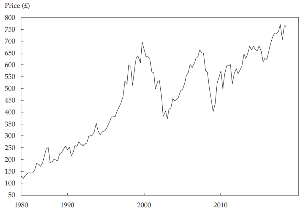
Figure:1
Bar Chart
Unlike line chart which has only one data point in each entry, bar chart in contrast, has four bits of data in each entry—the high and low price encountered during the time interval plus the opening and closing prices.
A vertical line shows the movement of prices along the day, of which top point shows the high of the day and bottom point shows the lowest price traded in the day, right hatch shows the closing price and left hatch shows the opening price of the day. Little bar indicates low price movement while bigger bar indicates large price movement.
Figure:2 shows the above explanation

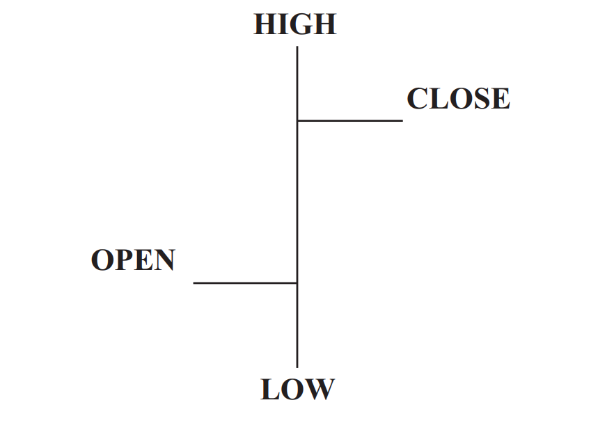
Figure:2
Figure:3 shows daily performance of the Brazilian Bovespa Index (BVSP) from late 2007 through late 2009. The top part provides the price open, close, high, and low; the bottom part shows volume. The downturn in the second half of 2008 is obvious, but also notable are the extreme price movements in the fourth quarter of 2008. There were 40 trading days from 29 September to 24 November. On 20 of those days, the closing value of the index changed from the previous close by at least 4 percent, a huge move by historical standards. During the same period, the average daily price range (high to low) was 7 percent, compared with 3.7 percent in the previous two months. This potentially important information would not be captured in a line chart.
Bar Chart: Bovespa Index, November 2007–November 2009 (Price in Brazilian Reais)

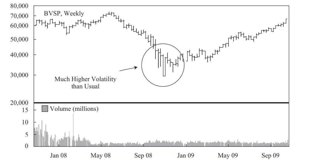
Figure:3
Candlestick Chart
Candlestick charts are a discovery of Japan, where technical analysis is in use for centuries. Like bar chart candlestick chart also provide 4 bits of prices in one data point, i.e. opening price, closing price, high of day and low of period.
As shown in figure: 4, a vertical line represents the range through which the security price traveled during the time period. The line is known as the wick or shadow. The body of the candle is shaded if the opening price was higher than the closing price, and the body is clear if the opening price was lower than the closing price.
Figure: 4 Construction of a Candlestick Chart
Each candle has two elements: body and wick/shadow

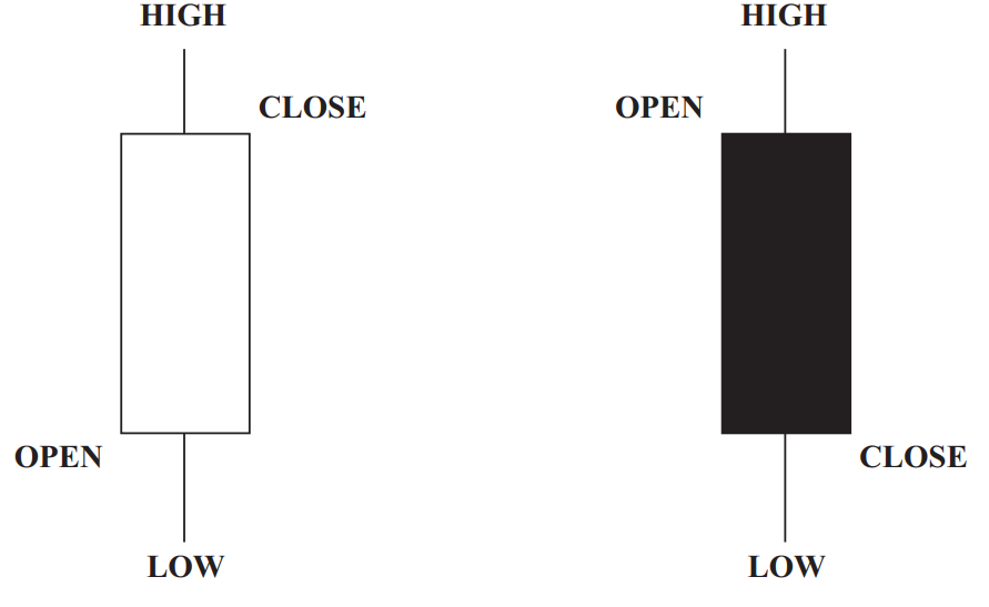
White body means market closed UP Dark body means market closed DOWN
Close > Open Close < Open
Figure : 5 shows a weekly candlestick chart for Companhia Vale do Rio Doce for the period 1 January through 15 June 2009.
Figure : 5 Candlestick Chart: Companhia Vale do Rio Doce, 1 January–15 June 2009 (Price in US Dollars)

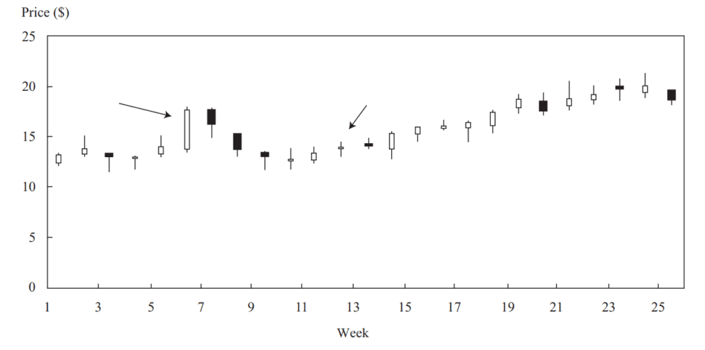
Candlestick charts are much more advantageous than bar chart as price movements are much more visible which helps in faster analysis. As shown in figure: 5 look at 6th candle and 12th candle, 6th candle shows large price movement, the stock opened near the low of the day and closed near the high showing steady rally throughout the day. In contrast 12th candle shows the stock opened and closed at the same price creating a cross-pattern. In Japanese terminology used in candlestick charts this cross pattern is known as “doji”. The doji signifies that after a full day of trading the positive influence of buyers exactly contradicts the negative influence of sellers that means market is in balance. If doji occurs after a long trend whether uptrend or downtrend, it indicates that trend will probably reverse.